Visualizing 150000 butterflies from the Natural History Museum
Click here for the interactive visualization.
The Natural History Museum in London has a data portal in which they provide digital records for many of their specimens. Some of these records have images. I recently learned how to use machine learning tools such as convolutional neural networks and I wanted to use the NHM data to see what can be done with these tools. The dataset of butterflies seemed particularly interesting to me because the images are visually interesting, yet they are all similar in that they all contain a butterfly in a canonical pose.
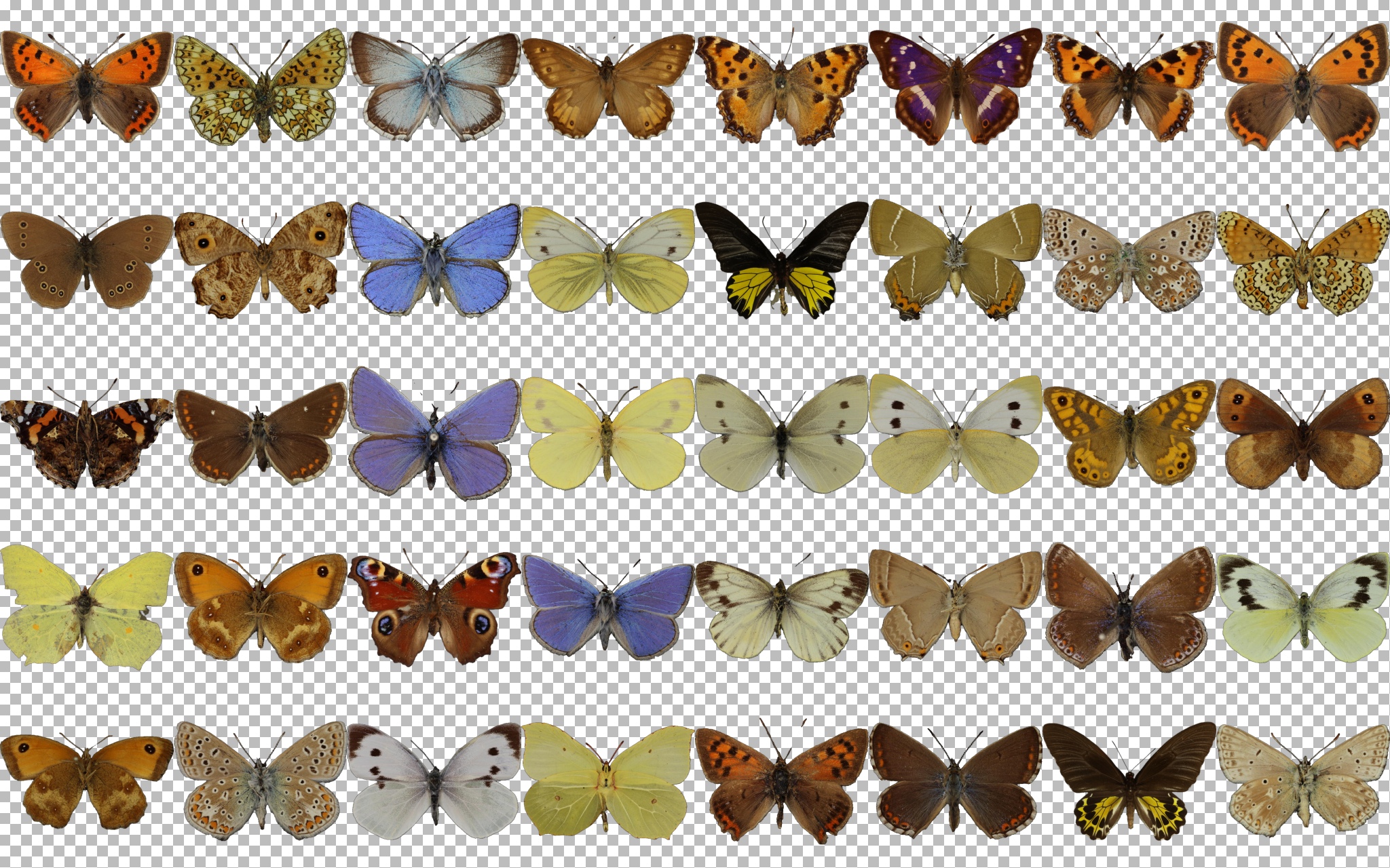
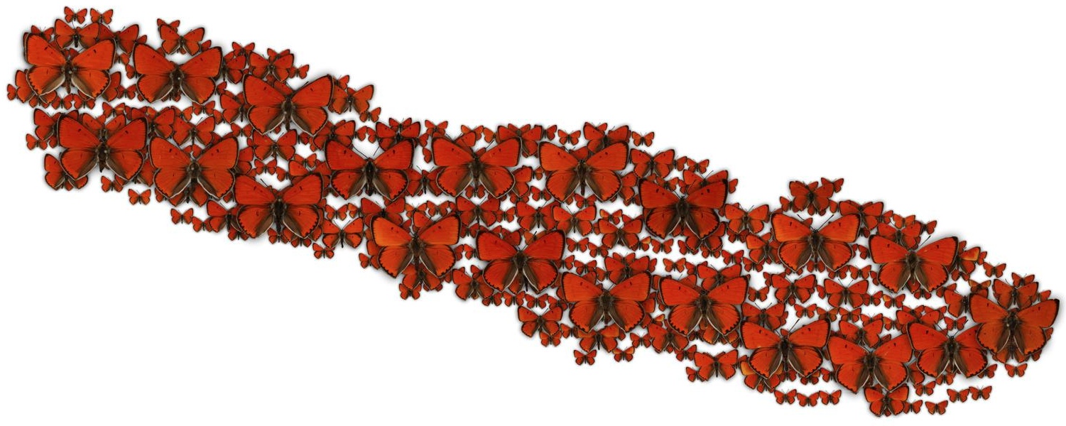
Since I'm only interested in learning the visuals of the butterflies and not the rest of the photographs, such as the labels, I needed to find a way to separate the butterflies from the background. Here, you can see one collection of ~2000 butterflies, which are photographed against a clear background:
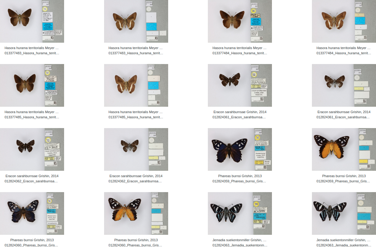
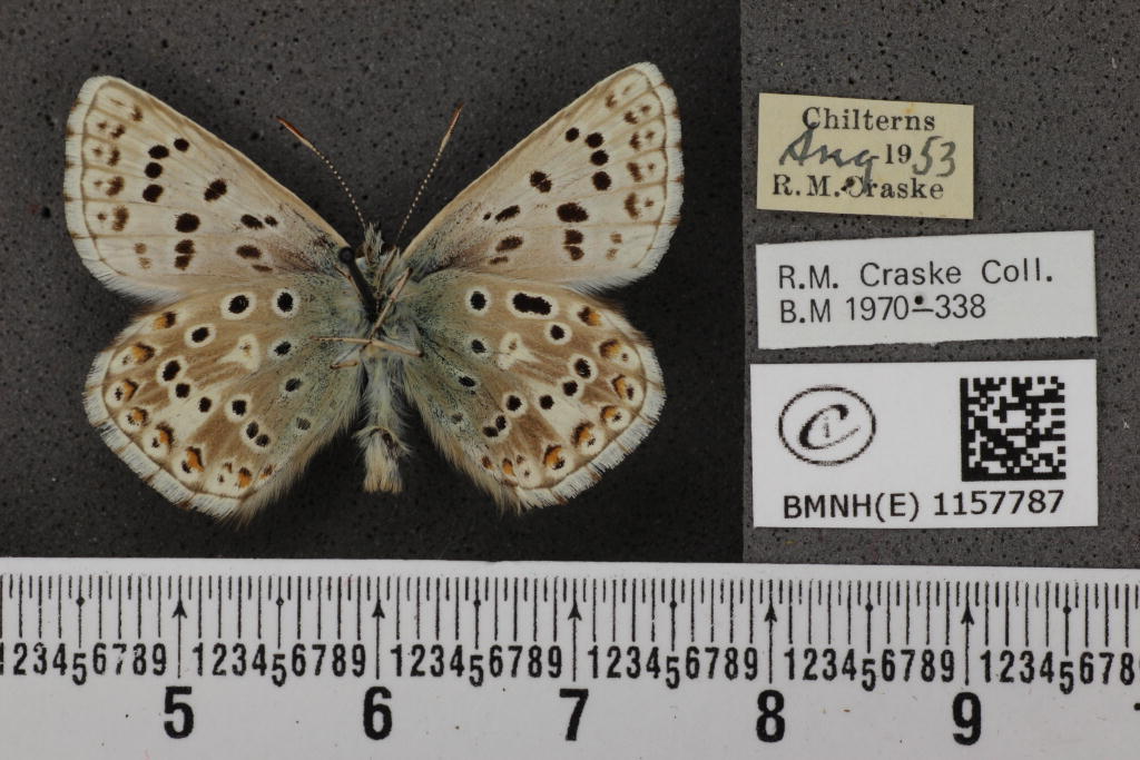
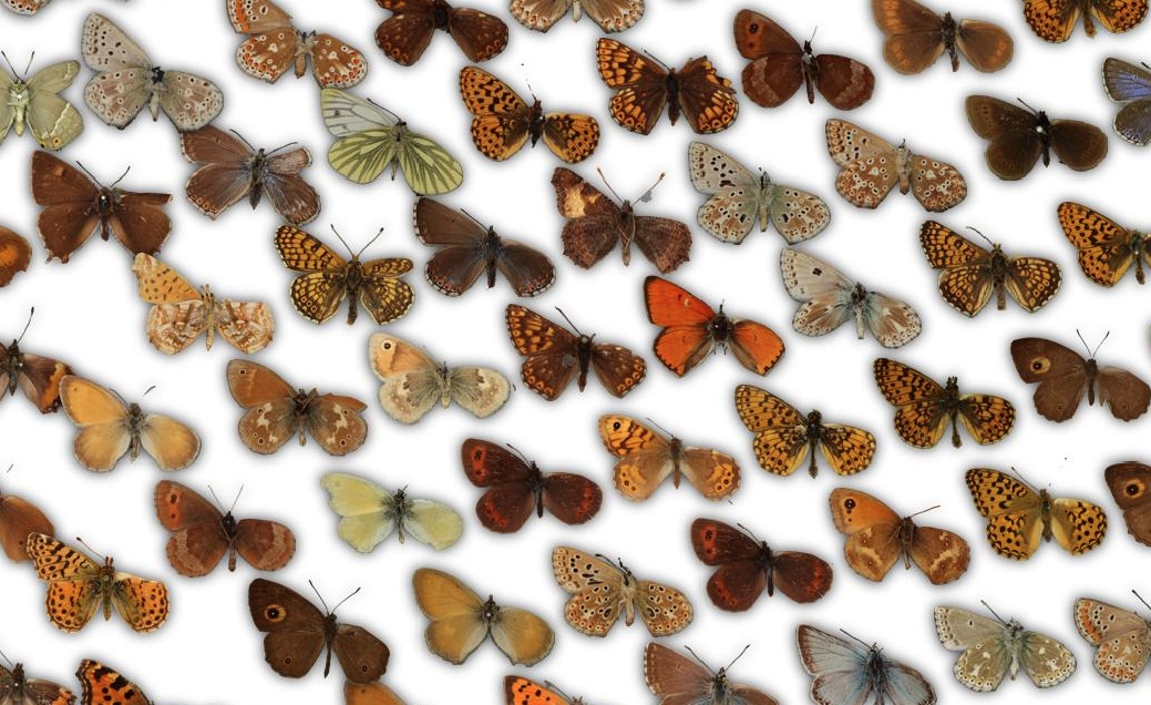
It is quite easy to remove the background automatically based on contrast. However, besides this collection, there are a lot more images of butterflies available. They can be found by searching for "lepidoptera" in the data portal. This way, I downloaded 30 GB of butterflies. Most of the 150000 images have noisy backgrounds with varying brightness, such as this one:
To separate the butterflies from the backgrounds, I trained a U-Net that predicts for each pixel of the image whether it belongs to the butterfly or background. It is a convolutional neural network that receives an image as the input and produces a new image as the output, in my case a background-foreground mask.
I started by manually creating masks for a few images:
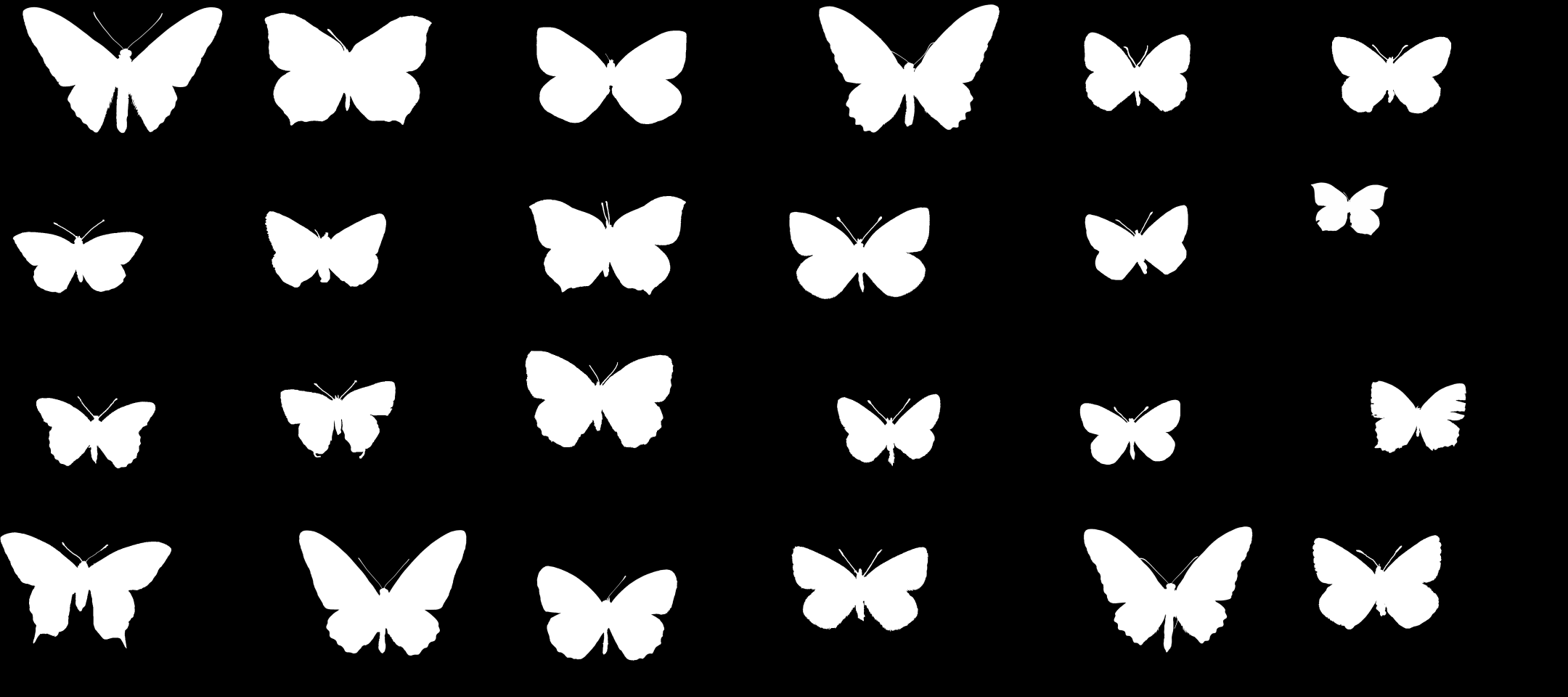
I trained the U-Net and tested it on random images from the dataset. From those I selected the images where the classification went poorly and manually added masks for them to the training set. This selection process leads to a ground truth dataset that contains mostly "challenging" items. I ended up with ~300 masks, however it works reasonably well even with fewer images. Since the network needs to make a prediction for every single pixel, it is forced to generalize even when trained on a single image.
Using the masks generated by the U-Net, I can remove the background and crop all the images in the dataset:
Next, I created a 128✕128 image with a white background for each butterfly and trained an autoencoder on them. The autoencoder receives an images as the input and produces a reconstructed image as the output. Its loss function is the difference between the input and output so that during training, it learns to reduce that difference and creates an accurate reconstruction of the input. The autoencoder has a bottleneck in the middle which consists of 128 neurons. This way, it learns to compress each image into a latent vector of 128 numbers.
Here are some examples of images reconstructed with the autoencoder:
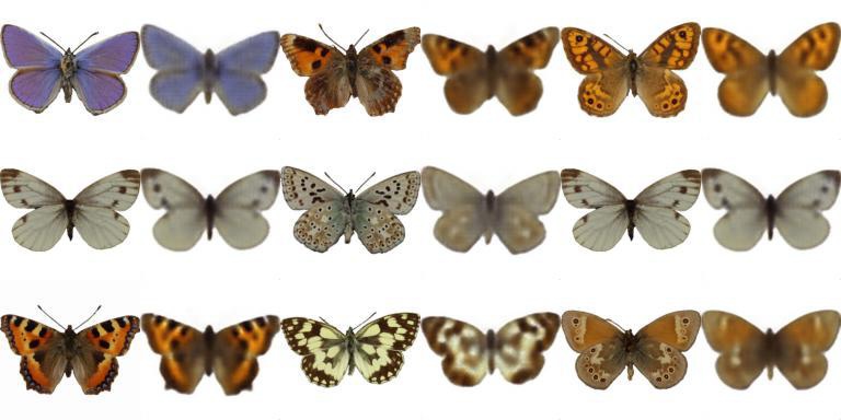
During 6 hours of training, the network didn't converge, meaning that a better quality could be achieved by training longer. However, for this project I'm mostly interested in the latent space learned by the autoencoder, not the reconstructed images.
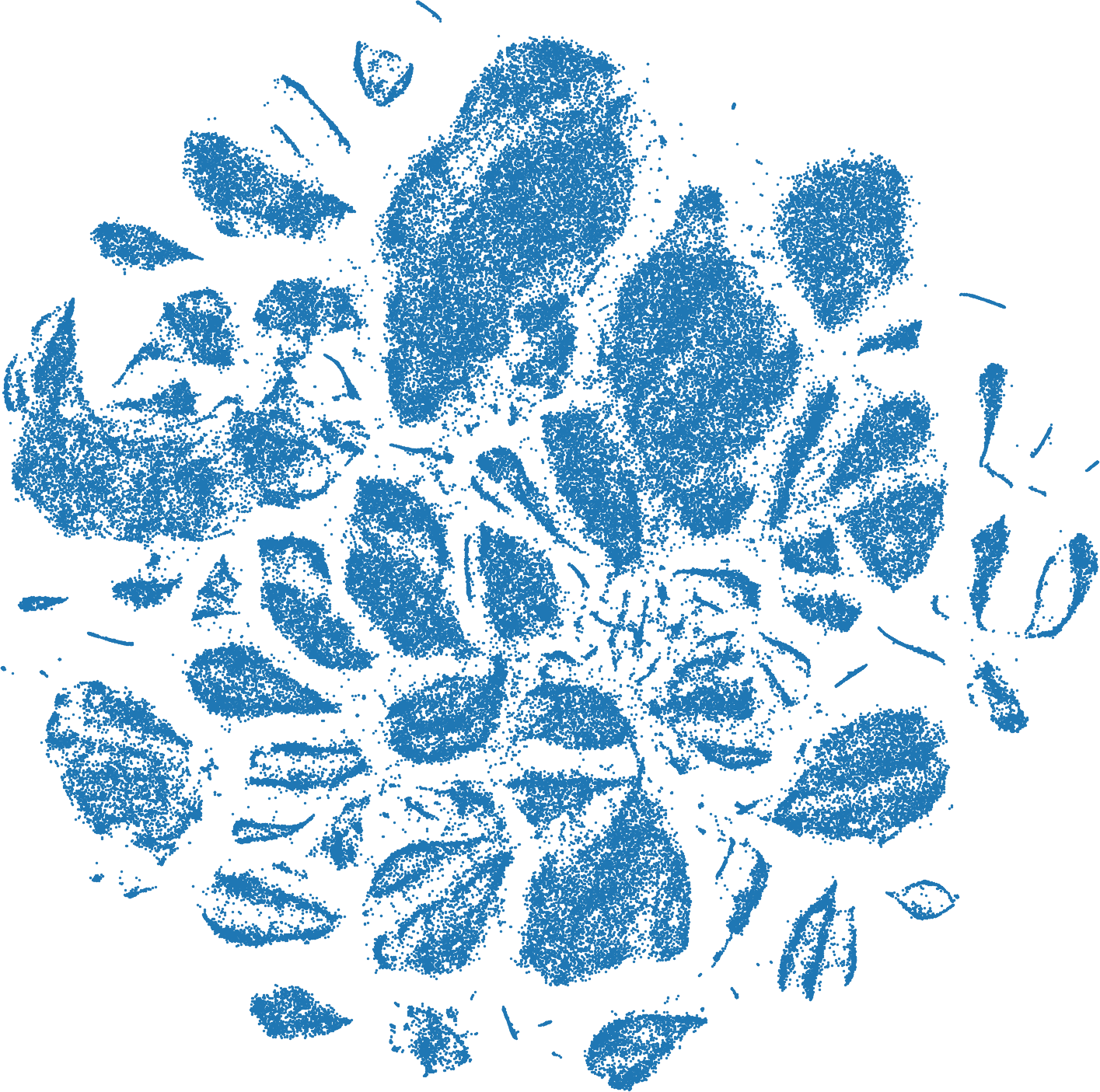
I used the encoder of the autoencoder to calculate the latent vectors for all images in the dataset. To visualize the latent space, I used t-SNE to transform the latent vectors from 128-dimensional space to a 2D plane.
In this t-SNE plot, each dot corresponds to an image in the dataset. The t-SNE transformation places the points so that those points appear close to each other that have similar latent vectors, meaning that they appear similar to the autoencoder.
Next, I wanted to replace the dots in the plot with images of the corresponding butterflies. To prevent overlapping of very close points, I iteratively moved them apart. This was done by defining a "safe" radius and finding all points that have a neighbor within this radius. Each point is then moved away from its closest neighbor by a small distance:
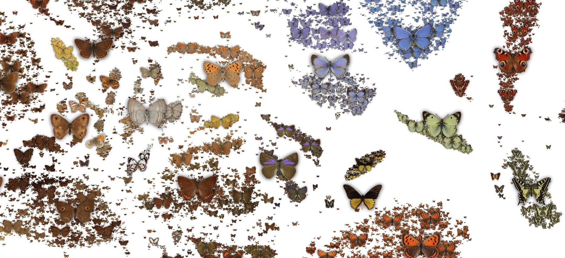
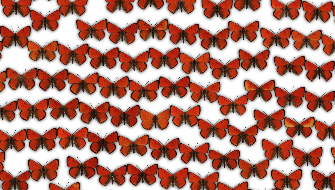
Here is a part of the resulting image, where I also added some drop shadows:
We can already see that similar butterflies are clustered together. However, this t-SNE plot is 131000✕131000 pixels big. That is 17 Gigapixels! To display it, I'm using Leaflet, a javascript library that can render maps. The image is split into tiles with a resolution of 256x256 pixels which are loaded dynamically by Leaflet. I also created tiles for lower zoom levels, so that people can zoom out like on a map.
When the map is zoomed all the way out, the images appear as tiny dots. For the intermediate zoom levels, I rendered a few "representative" images. These are selected by applying a k-means clustering to the t-SNE points. For each cluster, a representative image is rendered at the cluster center. The representative image is selected by calculating the average of the cluster in latent space (not t-SNE space) and finding the butterfly with the latent vector that is closest to the average. I found that when using t-SNE space to determine the representative, an outlier is often selected, which doesn't happen in latent space.
The tileset contains 138000 images, which is ~900 MB. This is what it looks like to zoom around in the interactive t-SNE plot:
Click here for the interactive version of the t-SNE plot.
I also added the ability to click on the butterflies to show a popup with the original image, the scientific name and some other data.

These information are provided in the NHM data portal as a CSV file. I wrote a script that creates a JSON file with the t-SNE positions of the points and the corresponding data. But this metadata file alone is 50MB in size. It is not feasible to load it when someone visits the website. So I split the metadata into smaller chunks using a quadtree, much like the images are split into tiles. Now the metadata is loaded only for the regions that the user looks at.
Using the data from these CSV files, I can color the dots in the t-SNE plot according to the genus of the butterflies:
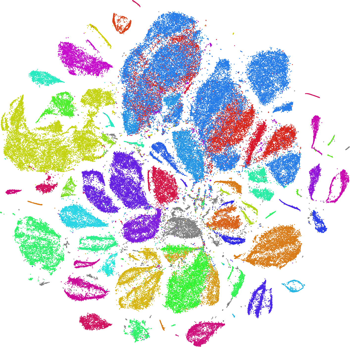
We can see that the autoencoder has learned to separate the butterflies by genus, solely based on the visuals, without being provided any information about the genus! This is an example of unsupervised training of a classifier.
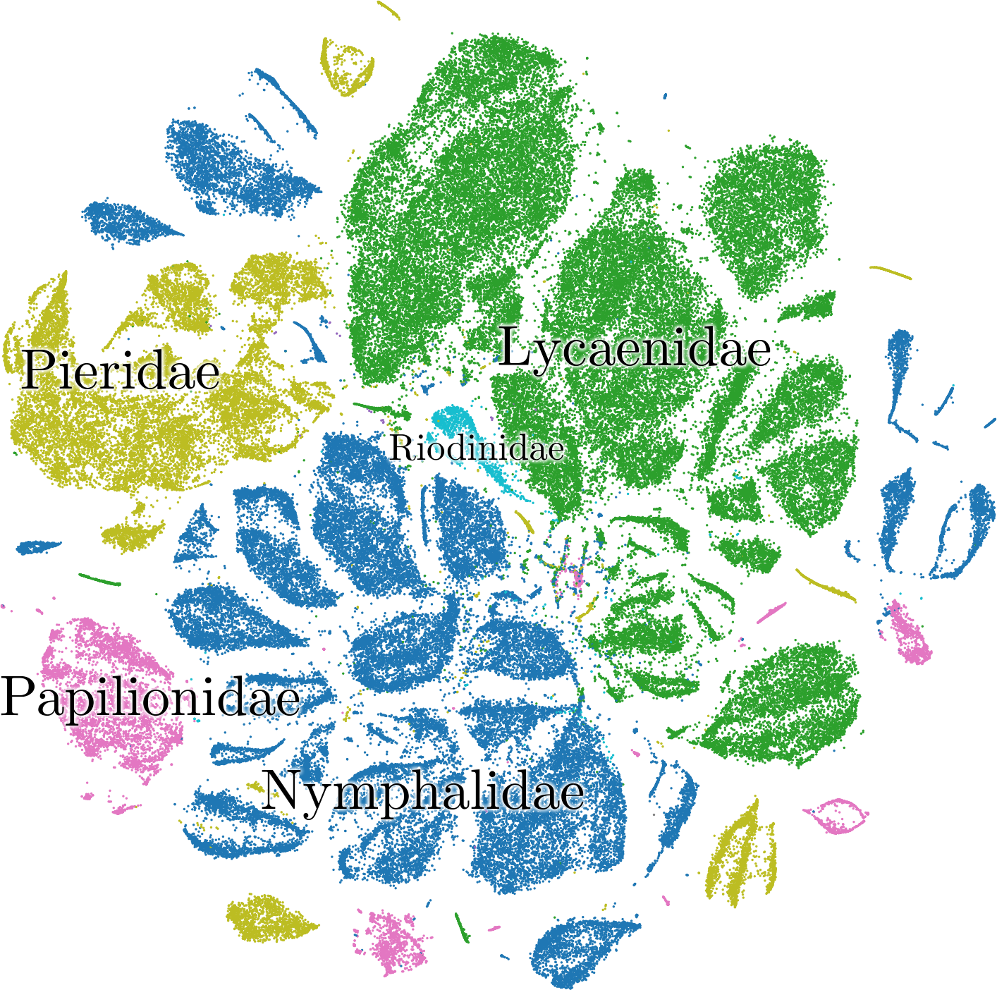
Similarly, it mostly placed the families in adjacent clusters:
There is an area in the plot where lots of colors mix. These are specimens with missing wings. Since the missing wing is the most striking visual feature, it primarily determines the latent vector that the autoencoder assigns.
Using the same method for the sex, we can see that most of the records contain no sex information. But for the birdwings, for which this information is available, the autoencoder has learned to separate male from female, again, without being tasked to do so.
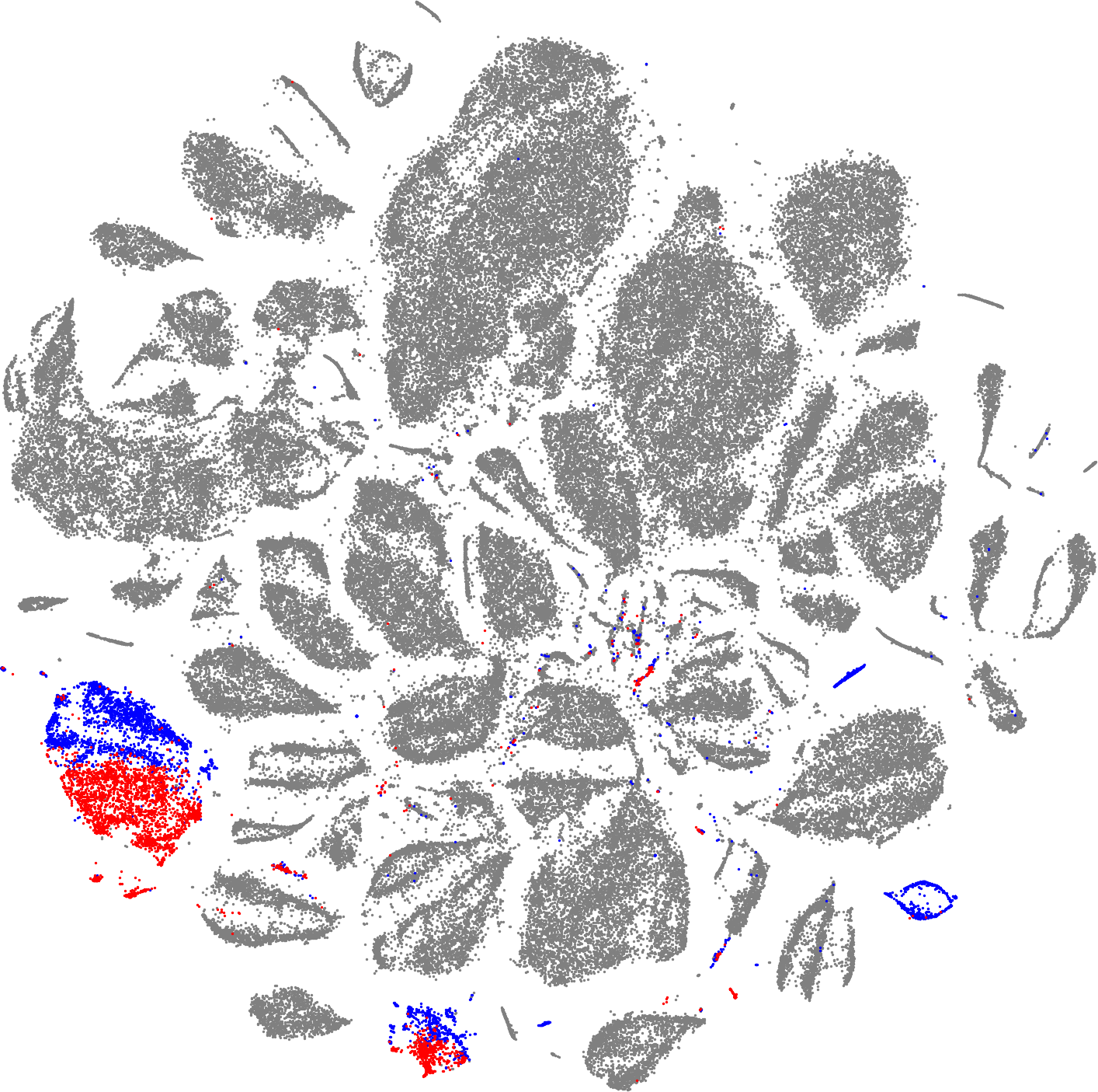
We can observe a similar result for the delias.
The source code for this project is available on Github. The images of the butterflies are provided by the Trustees of the Natural History Museum under a CC BY 4.0 license.